Components
Here, you can see the elements you can use on your website. Keep in mind that by applying your brand’s colors and styles, and adjusting component settings, the possibilities are endless, allowing you to create a truly unique website.
Redwall Standard components are WordPress content elements that you can easily add and customize on your website – whether it’s text blocks, image galleries, buttons, or more complex solutions. Below, you’ll find an overview of the different blocks with explanations and examples.
Customizable header
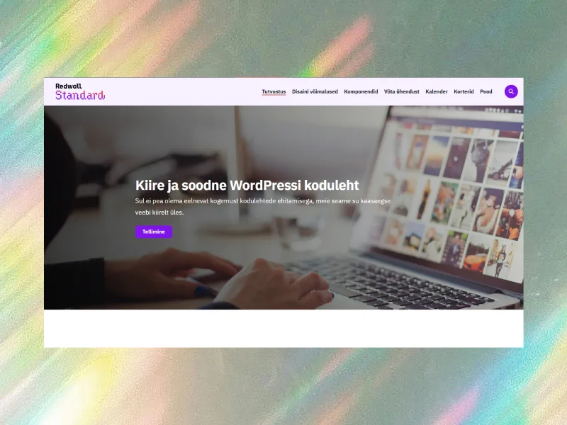
By default, each page has a header (see the top of this page) and a footer (see the very bottom of this page). The default header includes a title, a short additional text, and an image. You don’t have to add text and an image if you only want the title to appear on the page. You can hide the default header in the page settings and create your own. For example, on the homepage, we’ve replaced the header with a large image that also includes text and a button.
Customizable footer
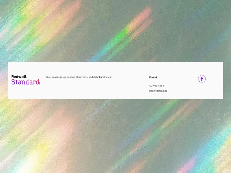
We’ve divided the footer into two sections, and you can customize the content yourself. For example, on this page, the right side features “Fast, modern, and affordable WordPress website up and running quickly!” and the left side has contact information with social media icons. The result looks as you see it here.
All blocks are fully customizable and can be combined with each other – place them inside one another and experiment freely. No matter how you use the blocks included with Redwall Standard, the result will always be responsive, meaning it will look great on mobile devices too.
Text-based blocks
- Text block – A simple text block for delivering paragraph-based content. You can adjust the text size, make it bigger or smaller, and also change the color.
- Heading blocks – Headings of various sizes that help structure the page. It’s important for SEO to use headings at different levels.
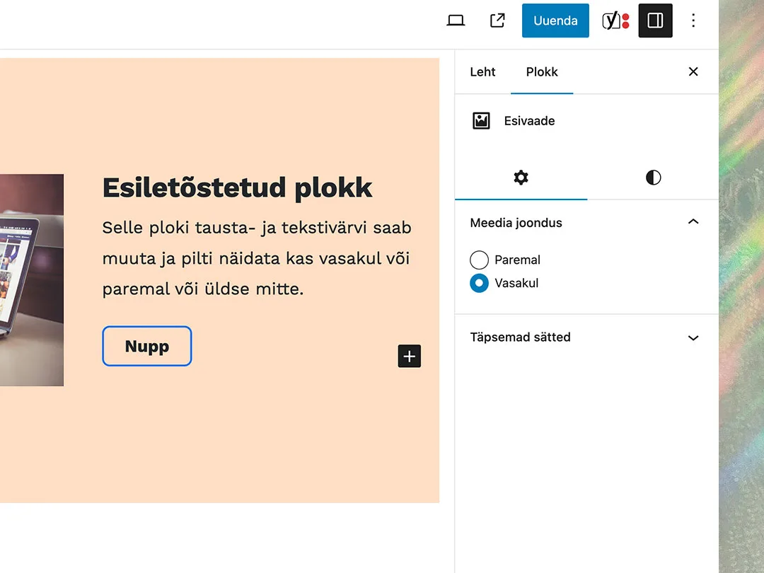
- Text and image block – A combined block where visuals and text complement each other. Just like this one! You can choose whether to display the image on the right or left (easy to change, as shown in the image).
- Quote block – A great choice for showcasing testimonials, references, or inspiring thoughts.
- List – Add all the key points in a bullet-point list. Just like this one here. There’s also an option for a numbered list.
Media-based blocks
- Image – Add images to the page in various sizes. Each image automatically displays its caption.
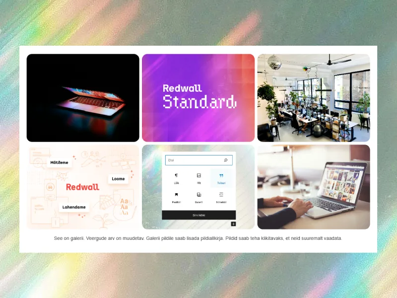
- Gallery – Place up to 8 images in a row – the images automatically fit into columns and fill the rows evenly. Each image can have its own caption.
- Audio – Add an audio file to the page, such as a podcast or a music track. The playback happens directly on the page.
- File – Upload a document that visitors can download with a single click. The “Download” button appears with the file.
- Video – Add a video file directly to the page that visitors can watch without navigating elsewhere.
- YouTube – If you enter a YouTube link, the video will automatically display instead. You can also add a caption if desired.
Structure and design blocks
- Columns – Place content in multiple columns. Ideal for introducing services or teams. You can choose both the number of columns and rows. Currently, we have added this text in two columns.
- Wide or narrow block – Blocks can be added in either narrow or full-width. You choose whether the block stretches from edge to edge or aligns left, right, or even center.
- Empty space – Creates breathing room between content blocks. You can adjust the size yourself.
- Highlight – This block is used on content pages to draw the user’s attention to important information.
- Divider – Creates a dividing line between blocks.
- Adding background color – Add background color to blocks to better highlight the content. This can be used as a design element to bring variety. For example, we have currently added a light pink background to this block, from edge to edge.
- Slider – A component of the website that allows displaying multiple images, text, or other content in a moving sequence. You can add it between content or, for example, as a header on the homepage. It’s a great way to add campaigns and other important information to the homepage that visitors could immediately see. See an example of the slider block below. 👇


Interactive and functional blocks
- Accordion – if you don’t want to display all the information right away, you can hide content behind collapsible rows. This is perfect for a frequently asked questions (FAQ) section or for hiding detailed information that only appears when the user clicks on it.
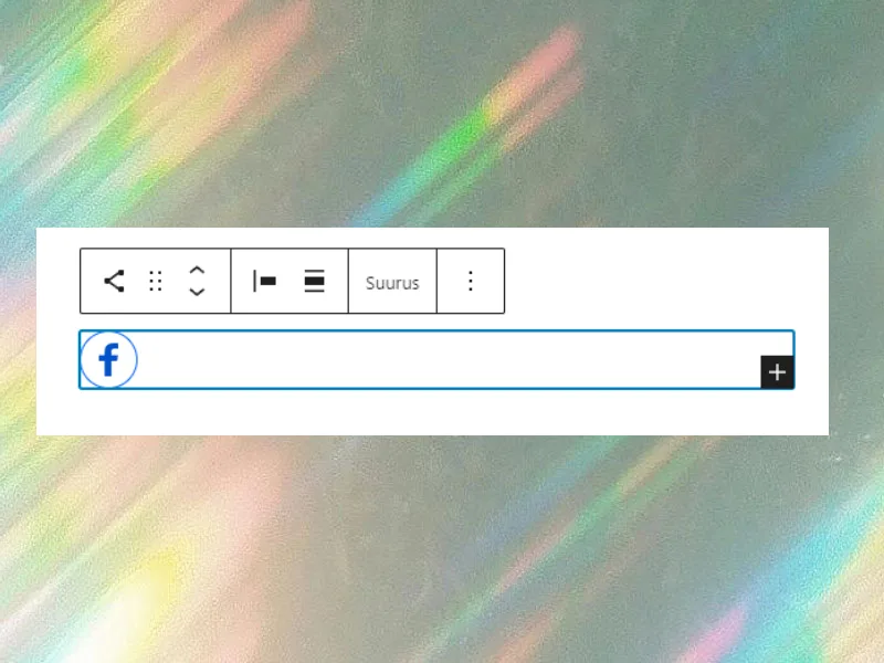
- Social media icons – a selection of icons that allow you to link to your social media channels. Perfect for the footer, header, or as a separate block alongside contact information.
- Inquiry, booking, and contact forms – various forms through which visitors can send feedback, make bookings, or submit inquiries. The fields of the forms can be customized according to your needs.
- Buttons – draw the visitor’s attention to the desired action, such as “Contact us”, “Learn more”, or “Subscribe to newsletter”. Choose the right style, color, and placement.
Additional options
You can add paid extensions to a website created with Redwall Standard to further customize it according to your needs. These extensions allow you to transform your Redwall Standard website into an online store, a real estate sales platform, or an event showcase platform. All three solutions use the color scheme assigned to Redwall Standard.
Online store
We offer an enhanced WooCommerce integration.
Real estate
A convenient and fast solution for real estate sales websites.
Calendar
For when you need to showcase events on your website.
Get in touch
Think Redwall Standard might be the right choice for your website? Drop us a message! If you’re wondering whether the quick website solution (Redwall Standard) supports a specific feature, just ask using the form below.